Goal this week: get the office in better order.
I have two "Princess" birthday cards to make by the weekend, and my table space that I desperately told Ben would solve the clutter in the scrapbook corner is covered.
Yeah, yeah big surprise. But I watched two episodes of Hoarders last week and that is enough for me. Plus, think of how much my productivity will go up if I can see my scrappin' table!
September 13, 2010
September 12, 2010
A day of indulgences
Yesterday I had to work my first full Saturday shift--open to close, to 4 p.m.
Saturdays at this store are very slow, and I was encouraged by co-workers to work on Sudoku or bring reading material for the afternoon.
During my lunch break I visited Barnes and Noble and quickly had to pick something entertaining. Though I was at first reluctant to spend the money, my eyes kept going back to this magazine, which I eventually purchased:

After work I walked a couple of shops down to Le Quartier Bakery. My only other visit had been on a lunch break, so I was too full to try anything. I decided it was time to support my local business and make another out-of-the-norm purchase:


German Chocolate, Cookies and Cream, Strawberries and Chocolate, and Red Velvet. We shared these with friends over coffee and Pinochle. My favorite was the Red Velvet; the cream cheese frosting was divine.
Before dessert, we went on a "double" with R and Jesse and tried out the Blue Orchid. The Thai restaurant doesn't have a website, but check out a photo of the interior.
Every indulgence I gave in to gave me inspiration for a new project, or re-interest in previous ideas. Let's see where my newfound inspiration will lead next.
**p.s. the lady at the bakery actually apologized; she said there was a mistake in the shipment, so the liners were pink instead of the standard silver. I love them!
Saturdays at this store are very slow, and I was encouraged by co-workers to work on Sudoku or bring reading material for the afternoon.
During my lunch break I visited Barnes and Noble and quickly had to pick something entertaining. Though I was at first reluctant to spend the money, my eyes kept going back to this magazine, which I eventually purchased:

After work I walked a couple of shops down to Le Quartier Bakery. My only other visit had been on a lunch break, so I was too full to try anything. I decided it was time to support my local business and make another out-of-the-norm purchase:


German Chocolate, Cookies and Cream, Strawberries and Chocolate, and Red Velvet. We shared these with friends over coffee and Pinochle. My favorite was the Red Velvet; the cream cheese frosting was divine.
Before dessert, we went on a "double" with R and Jesse and tried out the Blue Orchid. The Thai restaurant doesn't have a website, but check out a photo of the interior.
Every indulgence I gave in to gave me inspiration for a new project, or re-interest in previous ideas. Let's see where my newfound inspiration will lead next.
**p.s. the lady at the bakery actually apologized; she said there was a mistake in the shipment, so the liners were pink instead of the standard silver. I love them!
September 11, 2010
Just so you know
I was inspired today. And I am excited to add a new post to my blog sometime this weekend. It has been a horrifically long time since I have updated--not since I have created, mind you, but since I have documented the work.
More later.
More later.


August 29, 2010
Classy and Clean
How many of you go to in-home parties (i.e. jewelry, food products, home decor) and spend as much time analyzing the materials and brochures as you do the product on display?
Guilty.

image from premierdesigns.com
So of course I like to peruse materials, looking at: size, shape, colors, white space, and of course the fonts. I put myself in the designer's place and decide how he/she made each choice and how it is appropriate to the purpose of the piece.
Trajan Pro is the font that is featured in my Giant Blog Element posts. I'm trying to decide if it is overused. I tried to do some online research and couldn't find any good articles that were applicable, but I have just been noticing the font everywhere, especially in wedding-themed materials...and in Vegas I noticed quite a few posters for nightclubs and gentlemen clubs that use the font.
You would never want to use Trajan Pro for full paragraphs, as it is all-caps, but many businesses use it for headings. Paired with of course another more readable font and plenty of white space, it denotes classiness and professionalism.

image from premierdesigns.com
Guilty.

image from premierdesigns.com
So of course I like to peruse materials, looking at: size, shape, colors, white space, and of course the fonts. I put myself in the designer's place and decide how he/she made each choice and how it is appropriate to the purpose of the piece.
Trajan Pro is the font that is featured in my Giant Blog Element posts. I'm trying to decide if it is overused. I tried to do some online research and couldn't find any good articles that were applicable, but I have just been noticing the font everywhere, especially in wedding-themed materials...and in Vegas I noticed quite a few posters for nightclubs and gentlemen clubs that use the font.
You would never want to use Trajan Pro for full paragraphs, as it is all-caps, but many businesses use it for headings. Paired with of course another more readable font and plenty of white space, it denotes classiness and professionalism.

image from premierdesigns.com
August 23, 2010
Initial elements
Step one: break out the beloved brushes; squeeze out those beautiful and vibrant paints; and fill the whole room with the smell of turpentine. That first moment where the brush meets the texture of the canvas is so exhilarating!
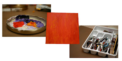 Step two: you decide you are too excited about the project to let it dry (plus you didn't add cobalt drier!) so take a picture of the canvas. Then manipulate the file in Photoshop, spending nearly as much time and having nearly as much fun, playing on the computer as you did with the actual paint.
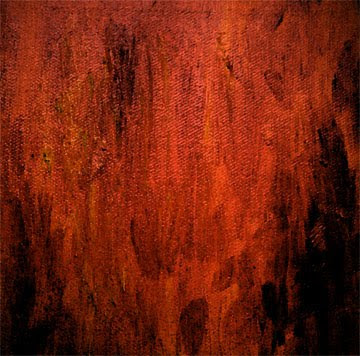
Step three: use part of the rich color and texture to add detail and intrigue to a white slate.
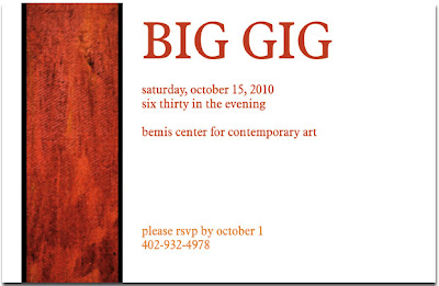 This was a first draft using minimal information for an invitation, based on this painting:
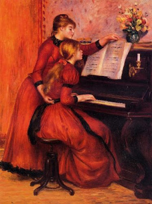 The Piano Lesson by Renoir; image found at artilim.com
 Step two: you decide you are too excited about the project to let it dry (plus you didn't add cobalt drier!) so take a picture of the canvas. Then manipulate the file in Photoshop, spending nearly as much time and having nearly as much fun, playing on the computer as you did with the actual paint.
Step three: use part of the rich color and texture to add detail and intrigue to a white slate.
 This was a first draft using minimal information for an invitation, based on this painting:
 The Piano Lesson by Renoir; image found at artilim.com
The theme changed, the colors changed (but how I love the rich, warm colors--so some of them still kept a strong role), just about everything changed over the course of this project. Wait til you see what emerged! But these were the initial elements.
August 8, 2010
I really should name them

With all the time I spend on my computer for projects, I couldn't imagine working without my dual monitors. It's so helpful to work on pieces of projects on each monitor, or be able to compare and contrast images.
Ben had an extra monitor and set it up for me when we lived in Fremont. He's just a little jealous that I can watch a show on one monitor and work on the other.
August 5, 2010
What a find!
Right around the time Amber and I became infatuated with finding the right Christmas tree decorations, I also became obsessed with finding creative and elegant ways to wrap gifts. Unfortunately, much of what I found that I loved from Better Homes and Gardens and Martha I had to dismiss as too expensive and time-consuming for my taste.
Even though I am an artist and feel that presentation is important, I am also a Skelton and don't find it practical to spend money on something that is going to be ripped and thrown away. (At least we can rotate the gift bags from person to person each year.)
Then I found the following:
 Featured on marthastewart.com, the above picture is of gifts wrapped in tissue paper and then wrapped again in a glassine paper. I'll go the easy way out and let you read about it on wikipedia.
I searched for this glassine paper everywhere, it seemed! I called places in Lincoln, looked online for a good place to order from--and finally found it at Dick Blick in Omaha. I was so ecstatic when the salesgirl said she had it; and then I was floored at how inexpensive it turned out to be.
I have a wedding this weekend to attend, and here is how the gift turned out:
 The card is simply two layers of cardstock; the "bride and groom" is printed on a regular inkjet printer; and I wrote a short note for the card on the backside. Because the glassine is wrapped over the tissue paper and card, the card cannot be accidentally separated from the gift.
 I just love the look of the layers/folds of the paper.
Even though I am an artist and feel that presentation is important, I am also a Skelton and don't find it practical to spend money on something that is going to be ripped and thrown away. (At least we can rotate the gift bags from person to person each year.)
Then I found the following:
 Featured on marthastewart.com, the above picture is of gifts wrapped in tissue paper and then wrapped again in a glassine paper. I'll go the easy way out and let you read about it on wikipedia.
I searched for this glassine paper everywhere, it seemed! I called places in Lincoln, looked online for a good place to order from--and finally found it at Dick Blick in Omaha. I was so ecstatic when the salesgirl said she had it; and then I was floored at how inexpensive it turned out to be.
I have a wedding this weekend to attend, and here is how the gift turned out:
 The card is simply two layers of cardstock; the "bride and groom" is printed on a regular inkjet printer; and I wrote a short note for the card on the backside. Because the glassine is wrapped over the tissue paper and card, the card cannot be accidentally separated from the gift.
 I just love the look of the layers/folds of the paper.
Subscribe to:
Posts (Atom)